 Share
Share
How do you renovate three apartments in a 19th-century building facing a small canal in the San Marco quarter of Venice, Italy? To Italian architects Andrea Marcante and Adelaide Testa, the answer was to use colours.
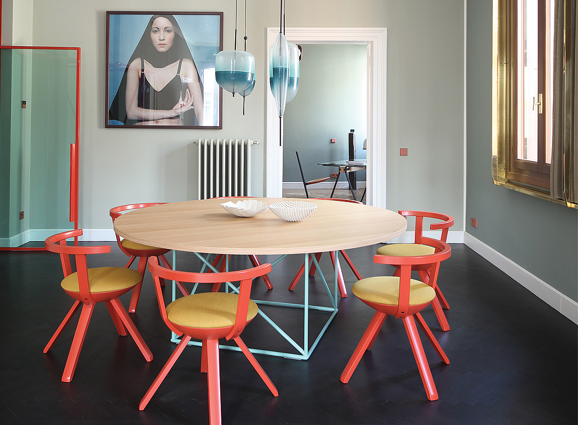
From terracotta to sea green, and gold to blood orange, the residences and their stairwell are awash in different hues.
But don’t be mistaken, this isn’t a quest to look like a rainbow. Instead, the duo succinctly capture and reinterpret the variety of the historic city’s colours and forms.
The concept reinterprets the relationship between the interior spaces and exterior, drawing on elements from the façade to create a modern design that responds to the location without overwhelming it.
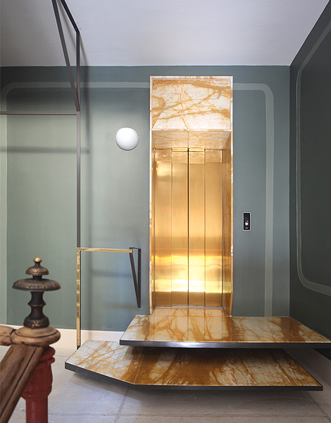
For instance, in the stairwell, iron and brass structures finished with black lacquer, as well as the integrated illumination, allude to the composition of the exterior facades.
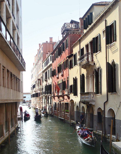
Inside the apartments, the relationship between the windows and the Venetian landscape is reinforced by a system of brass frames with gilded curtains of sheet metal.
Light fittings made from Murano glass create horizontal perspectives in the living area, their multi colours evoking the reflections of the city in its canals at dusk.
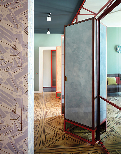
Venice’s landscape of waterways and rich tones also inspires the shadow effects on the wallpaper, the colours of the walls and choice of furnishings.
Further complementing the design are the light switches. These are from the classic LS 990 collection from JUNG, presented in a selection of Les Couleurs Le Corbusier colours.
This unique combination showcases how the German firm can facilitate projects that are the antithesis of monotonous tones.
Using lightness coefficients, the colours of the switches can be perfectly matched to those of the walls or wallpaper to achieve high visual contrast or camouflage.
It takes its inspiration from the Swiss-French architect, one of the most significant and influential ones in the 20th century, for whom the colours of a building were just as important for a successful design as were the plan and section.
Within the apartments, the square-shaped LS 990 range pairs perfectly with the strong concept of combining history with reduced modernism. Their rich hues are used as colourful accents, reinforcing wonderfully what Marcante and Testa set out to achieve.
This story is produced in collaboration with JUNG. It first appeared in Issue 109: April/May of d+a.